I’m taking a risk here.
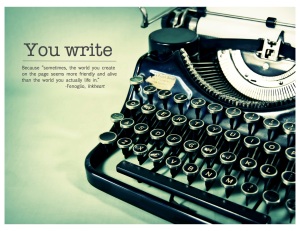
For my final Tasteful Typography project, I decided to go with the one I liked the most rather than our instructor’s favorite. Mind you, this one won (for me) by a very narrow margin. I think I have a soft spot for vintage typewriters.
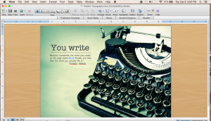
I did this project on Microsoft Word. Here is a screen shot:
Process: First, I determined that writers would be my audience and my message would be one of encouragement during moments of writer’s block. I sketched what I thought would make a good image. Then I went in a completely different direction. After googling several different ideas, I found this image of a typewriter here. Then I googled “quotes about writer’s block.” The quote I decided on isn’t about writer’s block but it does speak to my heart because I like to write.
(Well, I say I like to write but it’s really a torturous endeavor. Sometimes I think writers are masochists. Breaking hearts is part of our business, starting with our own.)
Critique Report: I posted my completed image on the class Facebook page and received the following critique from Tessie Conkey on Tuesday: she loved the image but suggested I raise the quote a little bit, which I did. Also on Tuesday, Natalia Gray pointed out to me that I needed an extra object, such as a line. So I added a line between the title and the body.
Font name/category used: Ameritype, serif for the title, and Euphemia, sans-serif for the body. Why I chose the weirdly named Euphemia I have no idea. Probably because the name was weird.
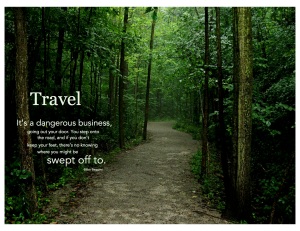
And because I just love these other two images so much, I decided to add them as a bonus.
This one includes my favorite quote (I love to travel):
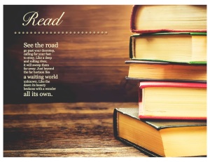
And I love to read.
Incidentally, this poem is from the Lord of the Rings musical. The best musical to have ever been cancelled.

This one was my favorite. I like the font you used because it just fit the typewriter theme. It honestly looks super professional! I also liked this quote the best. The other ones looked good, but the quote didn’t speak to me like this one did! Great job 🙂
http://www.taylorsplaceblog.wordpress.com
LikeLike
Amy you did awesome! The font you used is obviously perfect! And I loved all of the ones you did, but the typewriter one is for sure the strongest and the best themed. I am very impressed! Check out my work if you get a chance! http://www.blushcreative.co
LikeLike