Here we are at the end! I have learned so much this semester and I hope I’ve become a better designer because of it. For my final portfolio, I knew I wanted to incorporate my brand name, Climbing Ivy Productions. I used Illustrator (wahoo! I know how to use Illustrator!) to create this gorgeous climbing ivy for my intro slide. After I was finished, it did look beautiful…but a little too beautiful. Since my audience is potential clients, I wanted to appeal to all sides of the spectrum–not just the flowery feminine. So I had to “kill my darlings” so to speak. I saved my pretty flowers for another time and created a more streamlined ivy symbol. Then I got to work choosing my projects and the order. I decided to use a gradient background with varied colors to match the projects. But every time I tried to upload it to slideshare, some of the background gradients wouldn’t show up. So after a little frustration, I went back to my powerpoint and changed all the slides to gradient green like the first page. After I did that, I decided I liked it better that way. Everything looked more simple and unified (unify the parts, amiright?) and the green actually showed up for the party. Not like pale pink and pale gray. They were party poopers.
I wanted my message to convey simplicity. I wanted my projects to shine so I did little else aside from a gradient, a title, and a small leaf icon to tie everything together.
I really like ivy.
Critique: I got some awesome feedback this week. I actually kind of love it when people nit-pick because I want perfection. Melanie suggested I make sure my link actually worked and fix the gradient on a few slides. For some reason, when I uploaded the pdf to slideshare, a few slides lost their background! Oh, technology.
Brother Stucki suggested I fix the alignment and tracking on one of my slides. He also reiterated the need for a live link and fixed gradients. He also suggested I use correct capitalization. I took all these suggestions, plus a few new ideas I had, and created my finished product:
Whoever said online school was easy never took school online.
Just saying.
I have a three year old, a demanding baby, and strep throat so bear with me.
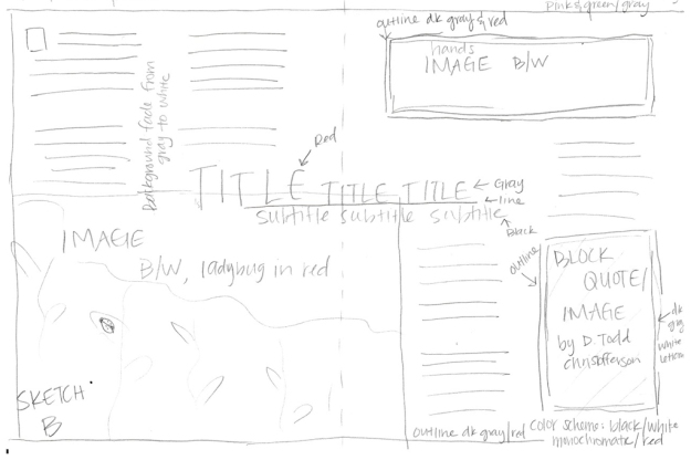
Here’s my sketch for the magazine spread:
Here is my shape map, roughly similar:
And here is my spread:
Process:
I had a really hard time with this assignment because the experience is both painful and sacred. But I wanted to take it seriously and I couldn’t think of anything else to write about. So I did a couple sketches knowing I had some pictures that would work with my theme. My audience is anyone suffering from a loss; especially the loss of a child. My message is one of hope, healing, and testimony. After doing my first shape map (which was based on a different sketch), I realized the arrangement wouldn’t work, so I scrapped it and started fresh with this sketch. Things came together more easily but making sure the details (especially the column alignment and the word placement) were a challenge. I sometimes wish I could just sit all day and design without interruptions, but that just isn’t possible.
Critique:
I posted the spread to Facebook and to Brother Stucki and I got some wonderful feedback. Melanie suggested moving the alignment of the pictures so they were both overlapping the center. Brother Stucki suggested blending the pictures into the background. He also suggested I let the type flow into the picture (making sure the type was still legible) and aligning my columns. That is HARD WORK! After printing, I noticed my colors need tweaking and I have a little orphan hanging out at the end of the first paragraph in the second column. Whoops. I also need to fix the line through the top picture.
Printing out the spread was a good idea.
Fonts: Avenir (sans-serif), Baskerville (old style), Great Vibes (decorative)
All the images belong to me, the bottom right taken by my friend Leigh Root and the upper left taken by my sister Jen Roberts.
First I brainstormed ideas on what kind of website I wanted. I used to teach dance years ago and I’ve always thought it would be fun to start my own studio. Then I looked up other dance studio websites online and made mental note of the things I liked about them. I also wrote down colors I liked. Then I created the sketch. I included a list of the items I needed on the side so I wouldn’t forget anything.
Then I created the wire frame using photoshop. It wasn’t too hard to put together and I really like digitizing my sketches. The wire frame made everything look neat. Then I went back to the web to look for images as well as mission statements and other typography on dance studio websites. Once I had the images I wanted, I made my rough draft of the website prototype.
Critique: I posted my rough draft to the Facebook group on Monday. Melanie Erickson suggested I put the address and phone number on one line. The phone number was a poor little orphan hanging out all by itself. Katie Hale agreed with her. Katie also suggested making the mission statement black and adding a pink box in the background. But to keep it unified with the rest of the page, I decided to rearrange the elements and put the mission statement on the bottom, make the wording pink, and vary the size of the letters to give it some visual interest. These comments were helpful and made me rethink the layout of my rough draft.
Then I went back and thought more about the FOCUS process. I added more length to increase negative space. I also wanted the elements to be unified so I gave the rest of the pictures a fading gradient to match the header. I added social media icons at the bottom, checked to make sure everything was aligned, and did a few final tweaks to the logo and the wording.
Color Scheme: monochromatic (black and white/light pink)
Font names: Trade Gothic (sans serif), Centaur (serif)
I couldn’t believe it when I saw this assignment. I’ve actually done this type of thing before…many times.
Here’s my finished product:
This is from a real movie called Austenland, a romantic comedy based on the book by Shannon Hale. It’s one of my favorite books (the movie is hilarious, but just not as good as the book). I wanted the message to be bright and fun, like the movie. I’m also a huge Jane Austen fan, like the main character in the film. And my husband is pretty much exactly like Mr. Darcy so it works.
As far as the process goes, it took many many hours to get it right. I had to do a lot of different layers. The background is one, the actors’ names at the top are another, the title is another, and of course myself is another. I also had to layer the lettering on the bag to match the hot pink title and make it look like it’s on the bag. I took a picture of myself wearing a shirt similar to the one the actress had on and posed in a similar way. I used unsharp mask on myself, deleting a few spots to reveal a less-sharp picture beneath it so it would soften me up. The title was a little blurry so I brought in a higher resolution one from another site. I also added my name at the top (I couldn’t get the font exactly right) and in the lower lettering.
Critique: my classmates are so sweet. Natalia Gray and Taylor Fabis loved everything in it. Melanie Erickson said she couldn’t tell where I ended and the actress began, all of which were wonderful complements. Brother Stucki suggested I fix my name at the top (which I tried and still couldn’t get it right), and add a layer to the wording on the bag to make it look more textured. I liked how that turned out. He also suggested I add a few tidbits in the lettering: little hidden fun things. I did that too, with the website http://www.thebookwasbetter.com.
Fonts: Gill Sans (title) Movie Font (sans-serif lower title) Avenir (sans-serif, website at the bottom).
Here is my collage. My images come from my box of various souvenirs I brought back from my trip to England nine years ago. (Wow, has it been that long??) I included various angles of the box itself, some ticket stubs and pamphlets, a few books, a flag, and a bottle of dirt. Yes, that is English dirt. (Side note: I didn’t actually get the dirt myself. Some friends went to England a few years after I did and brought the dirt back for me. It was all I asked for. I know, I’m weird. And obsessed. But I own some English soil!)
My process: I used early morning light from my back door and photographed the box on my fake wood floor. The effect was actually really nice and I liked it a lot. Then I uploaded the pictures to Lightroom, toned down the colors and gave it a dark vignette. Then I chose my favorite angles and pasted them on a single canvas created to 1024×1024 pixels. That way I knew at least one side fit the size specifications. Then I used the line tool to create the grid separation with white lines set at 5 pixels.
Critique: I showed my classmates on Facebook, who are all so incredibly sweet and loved the picture! Brother Stucki critiqued it and pointed out some problems I had with alignment. I also needed a little more contrast and variety and of course I’d forgotten to use a blending mode on one of my pictures. So I changed things around a little bit, fixed the alignment, changed a couple pictures, and added a textured picture. The texture is rough cement from my back porch!
The last thing I did was experimental: I darkened the lines around my picture to a really dark brown, almost black. I loved the effect!
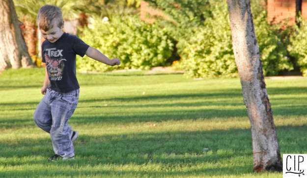
For images 1, 5, and 6, I took my kids for a walk outside and took pictures. Our church building is really close to where we live and I let my little boy run around in the grass outside of it. The weather is so beautiful in Arizona right now! I love the look on my son’s face in the last picture. It’s very characteristic. He makes that face when he’s feeling feisty.
Image 2 was set up in my son’s room next to his bedroom window. He’s had that monkey (or at least one identical to it…we had to replace it once) since he was born. For images 3 and 4, I took some pictures of my baby on his 6 month “birthday.” I take monthly pictures of my kids during their first year. I am in love with my sweet baby’s big brown eyes. His older brother’s monkey is in the background. We need to get him one too I guess.
The editing process began easily: the Lightroom tutorials were pretty cool and I enjoyed enhancing each photo and removing little imperfections. I don’t like the look of photos that are overly airbrushed so I kept that to a minimum. But when it came to the watermark, I wanted to shoot my eyes out. I couldn’t figure out how to do it for the life of me. The options wouldn’t show up in the export box. It just wasn’t there. I tried a roundabout way of doing it and after many google searches, tears of frustration (I admit it), and wanting to curse the name of watermark forever. The final product is the ugliest watermark there ever was but it’s there. Done.
The Social Media strategy is to use the infographic as a quick way to attract customers to shopping at Target (because, let’s face it, Target is every Mommy’s playground). My main audience is females between the ages of 18 and 65, or anyone who would like to save a few bucks. The objective is simple: quick info in a nice-looking format that can easily be shared through Facebook or Pinterest. These two social media platforms will connect easily to my target audience.
Here’s my finished product:
For my process, I went to piktochart.com and signed up for a free account. I picked the infographic template I liked best and customized it from there. Most of the fonts here were already on the infographic. I added the Target logo through piktochart’s easy-to-use customizing interface with just red and white circles. I changed the body copy to a sans-serif font for clarity in reading and darkened the subtitles in each section to give it some texture and hierarchy. I also added the arrows and dotted swirls to make it cute. Women like cute.
I submitted the finished infographic to the Passion For Savings website administrator and she really liked it! I told her she was free to use it in her website (since all the information is hers) and I really hope she does!
My critique process began with Facebook, where I posted it to be reviewed by my classmates. Tessie Conkey loved the dotted lines and arrows. Melanie Erickson, Natalia Gray, and Sue Bates all said it looked great. Brother Stucki also reviewed it and said it was nicely done. I’m feeling pretty proud of myself! I did make a few tweaks to streamline it (decreased the size on some of the titles, moved boxes around slightly, aligned some of the text) but I’m happy with the finished product.
Image source: all images were created through piktochart. Target symbol is a registered trademark to Target stores.
Font names: League Gothic (sans serif), Satisfy (decorative, used for the number labels only), Pacifico (decorative), and Questrial (sans serif)
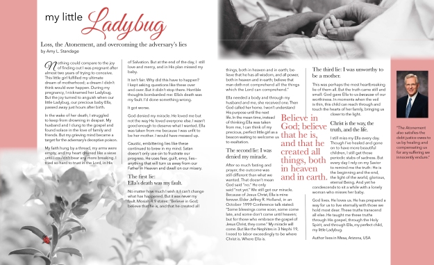
I really struggled with this project. The subject matter is incredibly heartbreaking and sacred for me, but I felt it was time to tell the story. It was extremely difficult to recall this time of my life but I hope that by doing so, I might be able to help someone. My audience is anyone who suffers from the loss of a child. The story comes from my own experience of my daughter’s passing.
Story:
My Little Ladybug, overcoming the lies of the adversary
Nothing could compare to the joy of finding out I was pregnant after almost two years of trying to conceive. This baby, a little girl, fulfilled my ultimate dream of motherhood; a dream I didn’t think would ever happen. During my pregnancy, I nicknamed her Ladybug. But the joy turned to anguish when our little Ladybug, our precious baby Ella, passed away just hours after birth.
In the wake of so much grief, I struggled to keep from drowning in despair. My husband and I clung to the gospel and found solace in the love of family and friends but my mind became a target of the adversary’s deceptive poison.
It isn’t fair. Why did this have to happen? I kept asking questions like these over and over. But it didn’t stop there. Horrible thoughts bombarded me: Ella’s death was my fault. I’d done something wrong that affected her fetal development. I delayed going to the hospital when I couldn’t feel her stir within me. If I’d gone sooner, she might still be here.
It got worse.
I was denied my miracle. God loved me but not the way He loved everyone else. I wasn’t good enough to deserve what I wanted. Ella was taken from me because I was unworthy to be her mother. I was unfit. I would have messed up.
Lies like these continued to brew in my mind, caustic and embittering. My faith hung by a thread, my arms were empty, and my heart drained like a sieve until I couldn’t bear any more breaking. I tried so hard to trust in the Lord, in His love and mercy, and in His plan of Salvation. But at the end of the day, I still missed my baby.
Satan doesn’t only use sin to frustrate our progress. He uses fear, guilt, envy, lies—anything that will turn us away from our Father in Heaven and dwell on our misery.
The first lie: Ella’s death was my fault.
No matter how much I wish it, I can’t change what has happened. But it was never my fault. Mosiah 4:9 states: “Believe in God ; believe that he is, and that he created all things, both in heaven and in earth; believe that he has all wisdom , and all power, both in heaven and in earth; believe that man doth not comprehend all the things which the Lord can comprehend.”
Ella needed a body and through my husband and me, she received one. Then God called her home. I won’t understand His purposes until the next life. In the mean time, I can be faithful. Instead of thinking of Ella as something that was taken from me, I can think of my precious, perfect little girl as a beacon waiting to welcome us to exaltation. God is in charge.
The second lie: I was denied my miracle.
After so much fasting and prayer, the outcome was still different than what we wanted. That doesn’t mean God said “no.” He only said “not yet.” We still got our miracle. Because of Jesus Christ, Ella is mine forever. Elder Jeffrey R. Holland, in an October 1999 Conference talk stated: “Some blessings come soon, some come late, and some don’t come until heaven; but for those who embrace the gospel of Jesus Christ, they come.”
My miracle will come. But like the Nephites in 3 Nephi 19, I need to labor exceedingly to be where Christ is. Where Ella is.
The third lie: I was unworthy and unfit to be a mother.
This was perhaps the most heartbreaking lie of them all. The truth came to me simply and quietly: Ella was given to us because of our worthiness… not taken from us because of our inadequacy. In quiet moments when the veil is thin, this child will be able to reach through and touch the hearts of her family, bringing us closer to the light, closer to the truth.
Christ is the way, the truth, and the life.
I still miss my Ella every day. Though I’ve healed and gone on to have more beautiful children, I still have momentary stabs of sadness. But every day I rely on my Savior to remind me the truth: He created the whole earth and worlds without end. He is the beginning and the end, the light of the world, a god, a glorious, eternal, powerful Being. And yet he condescends to sit a while with a lonely woman who misses her baby.
God lives. He loves us. He has prepared a way for us to live eternally with those we hold most dear. These truths transcend all else. He taught me these truths through His gospel, through the Holy Spirit, and through Ella, my perfect child, my little Ladybug.
Sidebar Quote: “The Atonement also satisfies the debt justice owes to us by healing and compensating us for any suffering we innocently endure.” Elder D. Todd Christofferson
Sketches:
I’m almost thinking of combining elements from both of them.
Images:
images courtesy of Leigh Root Photography and Jen Roberts Photography
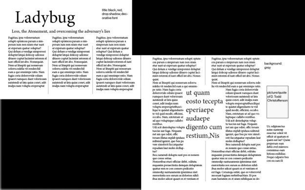
I took the lower sketch from above and created a shape map:
Then I inserted my pictures and text. I received wonderful critiques from classmates and from Brother Stucki. Melanie suggested moving the alignment of the pictures so they were both overlapping the center. Brother Stucki suggested blending the pictures into the background. He also suggested I let the type flow into the picture (making sure the type was still legible), align my columns, and turn the three-column first page into two columns.
Then I printed out my finished product and realized my colors were a bit off, along with a few other things I needed to fix. So I painstakingly went through every part that looked off and came up with this:
I really love how it turned out. I had it printed on 80 lb glossy white paper and my husband said it looked like it came from the Ensign! Here is a video of my final spread:
Fonts: Centaur (oldstyle), Avenir (Sans-serif), Great Vibes (decorative)
Pictures courtesy of Jen Roberts and Leigh Root. See above for link to Elder Christofferson picture source.
For this process, I first looked up a TED talk. The one that caught my eye was called “Your Elusive Creative Genius” by Elizabeth Gilbert, the author of Eat, Pray, Love. It was filmed in February 2009. After watching the talk and taking notes while doing so, I decided my audience would be anyone like me who sought careers and success through artistic or creative avenues. I wanted my message to be one of optimism but also realism. I also wanted it to coincide with gospel principles.
Next, I created a storyboard of sketches. Here’s a picture of it:
Then I searched google for the images I wanted. I originally intended to have more vector art in my slides but as I continued, I scrapped the idea and used only typography with the images I found. My color scheme ended up being warm browns, muted yellows, and a few peaceful hues of blue and green.
Once I had all the images, I worked them into my power point presentation and added the barest minimum of quotes from the talk. My intention was that the speaker would elaborate on these simple points.
Outline for the talk as it coincides with my power point presentation:
The Genius Within
by Elizabeth Gilbert
In ancient times, people believed that the creative genius came to each person.
Always by divine means.
The creative genius protected the artist.
If people didn’t like the work, the artist could blame the “genius” rather than their own incompetence or lack of experience.
As time went on, the idea shifted.
Instead of a person having a genius, a person was a genius themselves.
This idea created all sorts of problems, usually for creative people.
Why are we so afraid?
We’re doing what we love, our life’s work!
We fear failure, we fear rejection, we fear the dark path.
We somehow believe the lie that creativity = suffering.
For good reason: many modern artists suffered from depression.
There is so much pressure to be brilliant, to be the genius.
Instead of putting that pressure on ourselves, we can allow that genius to come and go.
Inspiration comes from sources we can’t explain during times we can’t predict.
Sometimes it’s by train. Sometimes by work mule.
So how to we utilize the little “genius fairy” if it’s unpredictable?
First, we have to let go of our fear.
We have to let the inspiration, or the “genius” go, with faith that it will return when we need it and are ready to receive it.
It will come back. It always comes back.
We have to get to work.
We have to show up and do our job. Whether you’re a writer, a designer, an artist, or a choreographer, we have to do our part and go to work.
Sometimes we have to plow through, force our fingers to the keyboard or the paintbrush.
But when we’re ready, our inner genius will return and help us create something brilliant.
Remember, you’re not a genius. You have a genius.
This genius is yours to borrow. Shift the responsibility of your work from the person to the muse.
Critique: I posted my slides on facebook. Koby Hansen suggested on Thursday that I make all the numbers in my presentation the same size, which I thought was a good idea until Katie Hale suggested I get rid of the numbers altogether if I didn’t have a good reason for them. Since I really didn’t have a good reason to have numbered slides, I got rid of them. I think it makes the presentation look cleaner.
Font names: Georgia (serif) and Neue Haas Grotesk (sans-serif)
My critique process was interesting. On Tuesday, October 13, I posted my first draft of the project on Facebook, got a few compliments, and only one piece of advice from Melanie Erickson. She didn’t quite know what to make of the blue text box and suggested I take the lines at the bottom and mirror them on the top. So I reworked the wording to simplify it and took out the blue transparent text box. Then I reposted my new version and again, got lots of compliments. This made me feel great! But I also got more wonderful advice from Melanie. She suggested I make the wording under the title a little thicker so it’s easier to read. Both critiques and compliments are immensely helpful and I thank my classmates for both bolstering my confidence and helping me refine my design.
Here is a screenshot of my original design on Microsoft word:
My process:
I like to run and I love Disney so I thought I’d create a “costume run” for my event. My benefactor is the Make a Wish foundation, or all children who have their wishes granted by this wonderful foundation. I found this image of a little girl and Cinderella here: http://cdn2.hellogiggles.com/wp-content/uploads/2015/04/22/slide_419330_5349794_free.jpg
My audience is the running/athletic community or anyone who would like to benefit the Make a Wish foundation. My message is one of magic, hope, and fun. I chose a color scheme based on the vibrant blue of Cinderella’s dress and the Make a Wish logo. It ended up being a monochromatic color scheme with the blue and white. This made the picture of Cinderella and the little girl stand out all the more.
Designing with Microsoft Word is a challenge. I was so tempted to use photoshop. But I didn’t! Every bit of this project was done with Microsoft Word. I blocked out various parts of the Make a Wish logo with drawn shapes so that it would fit my title, “Run for Wishes.”
Fonts used
Title: Trajan Pro serif because it matched the Make a Wish logo’s font.
Body: Avenir sans-serif.
Here is the link for the Make a Wish foundation logo I used:


